The blobs on the book are not all the same. One is a target, the other is a wall.

Hi trader,
the first time I opened a liquidity heatmap I had exactly one thought: now what?
A screen full of colored blobs scrolling past, some big, some small, all of them looking like they were telling me something while telling me nothing.
It took me a while to figure out I was looking at the right thing with the wrong question.
Ok, vamos.
The misunderstanding that makes almost everyone quit
First, let’s get rid of the thing that makes people try order flow and give up after two weeks.
It’s not about clicking fast.
We’re not talking about reading the tape and pulling the trigger in the moment. That’s a different job, it takes pro-level reflexes every single day, and frankly it’s not mine.
Order flow is for something different and much calmer: choosing which level.
Because the chart tells you where the level is. The book tells you whether somebody is actually there behind it.
Two different pieces of information, needed at two different moments. The chart is enough to place an order. The book is there to decide which of the three levels you’ve marked is the good one.
And you do it beforehand, calmly, not while price is running.
How to read a heatmap, in three lines
Kept simple, because the first time it looks like alien stuff.
Time runs from left to right. What you see on the left is the past, the right edge is now.
Every horizontal row is a price. Always the same price, crossing the screen.
Color tells you how much size is resting at that price. Bright means a lot, dark means little.
That’s it, you already have everything. A bright, stretched-out blob means there’s been size resting at that price for a while.
And here’s the thing no other panel gives you
This is the reason you look at the heatmap first.
Of all the book panels, it’s the only one with time built in.
The ladder tells you what’s there now. Profiles tell you the cumulative picture. Only the heatmap shows you how long that wall has been there.
And that changes everything, because the distinction that really matters isn’t how big a block is. It’s how long it’s been there.
The two blobs that look the same
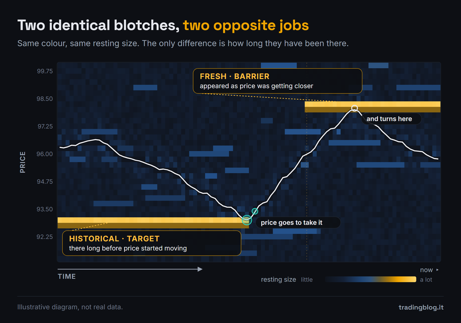
Look at the figure above. Two blocks, same color, same size. They do opposite jobs.
The long trace was there before price started moving toward it. Somebody placed those orders when the market was somewhere else, and left them.
That’s historical liquidity, and I read it as a magnet. Price tends to go there. To me it’s a target.
The short trace showed up as price was getting closer. Somebody saw the market coming and parked there on purpose, right now.
That’s fresh liquidity, and I read it as a barrier. That’s where I expect real resistance.
Historical means target, fresh means wall. Two identical blobs on the screen, two opposite things to do with them.
Color fools you, and this is where people get it wrong
Now the counterintuitive part, the one that’s worth the whole article.
Color matters less than it looks.
It tells you how big that block is. It doesn’t tell you what job it’s doing.
And on top of that, the color scale is relative. The platform recalibrates it on its own, so the same red this morning and this evening can mean two different sizes.
A huge red trace screaming off the screen, if it’s old, to me it’s still a target. And selling into that wall just because “it’s massive, price will never get through” means risking the wrong trade while holding the right information.
It’s the most frustrating way to lose: you saw the thing, and you read it backwards.
The right question in front of a big blob isn’t “how big is it”. It’s “how long has it been there”.
“But it’s all fake anyway”
Now the objection everyone raises after a week, and it has to be dealt with because it’s half legitimate.
Yes, some of that size isn’t real. There are people who show orders they have no intention of getting filled, just to make it look like there’s a wall at that price, and then pull them before price gets there.
It’s called spoofing, it’s illegal on regulated markets and it gets prosecuted. In the US it’s been a crime since 2010, under Dodd-Frank. In Europe it’s banned by the MAR regulation. And this isn’t theory: in 2020 JPMorgan paid 920 million dollars for spoofing in metals and Treasuries.
That doesn’t mean it never happens anymore. It means it’s not the mechanism running the market day to day.
Because most cancellations aren’t manipulation. They’re people changing their minds, algorithms repricing, market makers updating their quotes all the time.
And pinning every cancellation on a conspiracy is the fastest way to stop thinking.
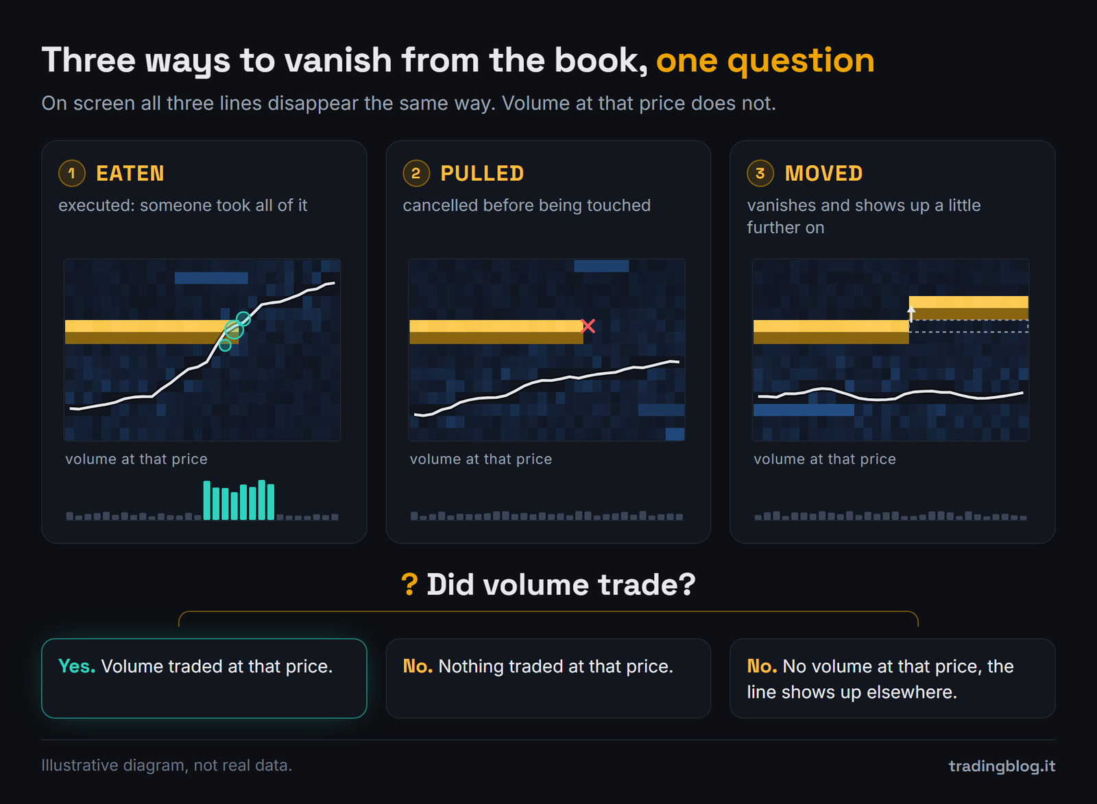
Because a row can vanish from the screen for three different reasons, and on the screen all three look the same.
It got eaten, meaning filled. Somebody took the whole lot. How you spot it: volume went through at that price.
It got pulled, meaning cancelled. How you spot it: nothing traded at that price. The row goes away and not a single contract changed hands there.
It moved. It disappears from one price and shows up again a little further along, without any volume going through there.
The question that separates them is always the same, just one: did volume go through?
Just watch out for one thing: sometimes both happen at once. Some volume goes through, and the rest of the wall disappears. Then the question becomes: did as much volume go through as the wall was big?
You don’t need to read minds
Here’s the freeing part, because it takes a weight off your shoulders.
You don’t need to figure out anybody’s intentions.
You don’t need to know whether it was spoofing, an algorithm, or a fund that changed its mind at a quarter past ten. You’ll never know, and you don’t need to.
What happened at that price, on the other hand, you can see, it’s right there on the screen. Start from that.
I look at the book in the DeepDOM, but the reasoning works on any heatmap, Bookmap included: the graphics change, what you’re reading doesn’t.
Two lines of transparency, which feel owed: that above is an affiliate link. If you use it and subscribe I earn a commission, and you don’t pay a cent more.
What you do starting tomorrow morning
Open a heatmap and don’t look at the colors. Look at the lengths. For a week, just that. Write down which traces were there from before and which ones showed up at the last minute.
Then look at what price did. How many times it went to grab the old ones and how many times it turned on the new ones.
And when one disappears, only ask yourself whether volume went through. Don’t ask why it disappeared. That question has no answer and you don’t need it.
Color tells you how big that wall is. It doesn’t tell you what job it’s doing. How long it’s been there tells you that.
Let me close with the thing that made it all click.
For months I looked at the book searching for the biggest blob.
Then one day I stopped asking how big it was and started asking how long it had been there.
From that moment the screen stopped being full of colored noise, and became a map.
Suerte Amigo!
Tiziano Brunno
Tradingblog
Want to put your market reading to the test?
Compete and challenge other traders inside an Arena in a demo environment, with no real capital at risk. Discover the Performance Arena Events by The Thunder Trader.
Disclaimer: purely informational and educational content. It does not constitute financial advice or an invitation to trade. Trading involves the risk of capital loss.