The value area is not 70%. It is a knob.

Hi trader,
for years I looked at the lower edge of the value area as if it were carved in stone.
Then one day I opened the exact same session on two different platforms, and the two VALs were not at the same price.
Same future, same session, same trades. Two numbers.
Nothing was broken. The two platforms simply were not doing the same calculation, and neither of them had ever asked me about it.
That is where a question started that I suggest you ask yourself too, because it is one of those that move things: how many of the levels on my chart are a measurement of the market, and how many are somebody else’s default?
Ok, vamos.
What we are actually looking at
The volume profile is a histogram turned on its side.
For every price level it tells you one thing only: how much was traded there.
From that histogram the platform pulls out three numbers and draws them on your chart:
- the VPOC, the price where the most volume of all went through
- the VAH and the VAL, the two edges of the value area
The first one is a measurement.
The other two are a choice.
And the whole difference between a measurement and a choice is what this piece is about.
If the vocabulary is missing (TPO, initial balance, how the Market Profile bell is born), start from the piece where we took poor highs and poor lows apart, and then come back here. That one is the language, this one is the handle.
Where the 70% comes from
The Market Profile was born at the CBOT in Chicago in the 1980s, out of Peter Steidlmayer’s idea of representing the day as a distribution: the prices where the market spends most time sit in the middle, the rejected ones sit in the tails.
If that distribution really were a gaussian, one standard deviation around the mean would contain 68.27% of the cases.
Round it up, and there is your 70%.
So the number almost everybody treats as a property of the market is this: a rounded statistic borrowed from a theoretical curve.
And the theoretical curve is exactly the problem.
The profile of a real session is almost always anything but a gaussian. It has two humps, it has fat tails on one side only, it has holes in the middle. Trend days are stretched out distributions that look nothing like anything symmetrical.
So we are applying a convention born on an ideal curve to a shape that is never that curve.
It is not a reason to throw the value area away, which remains the most honest tool we have for saying “in here the market accepted, out there it rejected”.
It is a reason to know that the market did not decide that 70. A tradition did.
How the area is really built, which is the part nobody looks at
This is where the most common misunderstanding of all lives.
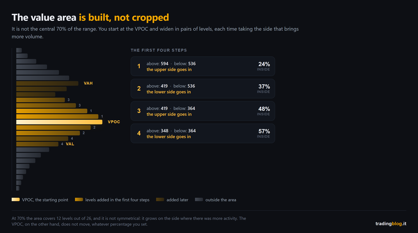
The value area is not the central 70% of the day’s range.
It is the result of an algorithm that starts from one precise place and widens:
- you start at the VPOC
- you look at the two levels above and the two levels below
- you take the pair that brings more volume, and you add it whole
- you repeat until the volume inside reaches the chosen percentage
Two practical consequences come out of this mechanism, and they are worth more than the definition.
The area is not symmetrical, and it is not supposed to be. It grows on the side where there was more activity. If the VAL is miles away from the VPOC while the VAH is glued right on top of it, that is not a software defect: it is the shape of the day telling you which side something happened on.
The edges move in jumps. They get added in pairs, and one fat level just outside the edge can come in all at once. One extra percentage point on the knob sometimes moves nothing, and sometimes moves your VAL by six ticks. It depends entirely on what is sitting out there.
And here is the detail that explains the story I opened with: not every platform widens in pairs. Some add one level at a time, picking the heavier side each step. They are two different algorithms that start from the exact same profile and end up on slightly different edges.
Neither one is right and neither is wrong. The point is that one of the two is on your chart and you probably do not know which.
Turn the knob yourself
This is the same thing, but with your hands on it.
Below is a session profile. The slider decides how much volume you want inside the area.
Take it to 50, then take it to 90, and watch where the two edges end up.
Then look at the VPOC.
It has not moved.
The one thing that does not depend on you
The VPOC is the only level on the profile that does not depend on the percentage you set.
That is not an opinion, it is a maximum. The level where the most volume went through is that one, no matter how you turned the knob.
Which is why, if I have to keep one single level off the profile, I keep that one.
That said, I do not want to sell you the VPOC as an oracle, because there is more than one knob.
The VPOC still depends on which session you are profiling. If you profile the US session only or the full 24 hours, the centre of gravity can land in two different places, and not by a little. That is a setting of yours too, it just lives in another menu.
And it depends on what you are counting. The classic Market Profile counts time, that is, how many half hours touched that price. The Volume Profile counts contracts. In the exact same session the time POC and the volume POC can sit at different levels, and anybody who looks at “the POC” without knowing which of the two they are looking at will sooner or later argue with a friend who has the other one.
This is not nitpicking. It is that when you open a chart shared by another trader, those three levels on it are three of their choices too.
What actually changes in your trading
That was the theory. Now the part that touches your account.
If the edge of the area is the result of a percentage, then the right question is not “did price touch the VAL”.
The right question is: what is behind this edge?
Because there are two very different edges that look identical on a chart.
There is the backed edge: the percentage ran out right there, but just below it the profile carries on nice and fat. If price breaks through it does not find emptiness, it finds more people who traded. It is a break that is born with no room.
And there is the edge facing the hole: below the VAL the profile thins out immediately, a few skinny rows and then nothing. There a break has an open road, because price travels fast through the areas where almost nothing was traded.
Same level, same label, two opposite situations.
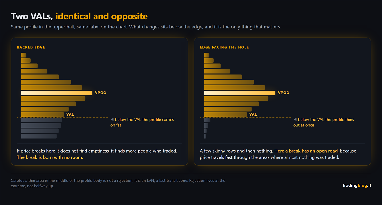
One clarification is needed here, because it is a mistake I have already seen made: that thin area, if you find it in the middle of the profile body rather than at the extreme, is not a rejection. It is an LVN, a fast transit zone. We covered it when we took poor highs and poor lows apart, and the difference between a notch at the extreme and a notch halfway up the body completely changes what you should expect.
And this is where everything we did over the summer hooks back up.
The profile tells you where to look. The footprint and the delta tell you what is happening while price gets there.
At the edge the question is always the same one we asked ourselves talking about bid/ask candles and about CVD: who is in a hurry, and who is sitting still and waiting.
A level on its own has never saved anybody. A level plus the context of who is attacking it, that one has.
The acid test on your own rules
There is a test you can run tonight, and it is brutal.
Take one of your rules that uses the edge of the value area. Any of them: “I do not buy above the VAH”, “if it opens outside the area the day is directional”, whatever it is.
Now run it again at 60% and run it again at 80%.
If the outcome changes, that is not a rule about the market. It is a rule about your settings.
It does not mean throwing it away. It means you have found out that it is fragile, and that either your real level is somewhere else, or you need one more condition to keep it standing.
Better to find that out on a chart tonight than with money on the line on a Wednesday afternoon.
What you do from tomorrow morning
Three things, and the first one takes two minutes.
Open your platform and write down three pieces of information in black and white: what percentage it is using, whether it counts volume or time, and which session it is profiling. If you cannot answer one of the three, that level on your chart is not yours. It belongs to whoever wrote the default.
Put two profiles on the same chart, one at 60 and one at 80, and keep them for a week. Not to trade off them. To see how much the edges swing on your instrument and your hours, which is not how they swing on mine.
The VPOC, on the other hand, treat it for what it is, the centre of gravity of that day’s auction, and mark it. The interesting part is not where it sits today, it is what price does when it comes back to it tomorrow or next week.
And if you mark them in your diary instead of in your memory, in a month you have a statistic of your own instead of an impression. The difference between those two things is the whole craft.
The VPOC is a measurement. The value area is a setting. On a chart they look like the same thing.
Let me close with the thing that changed my head on this subject.
It was not finding out that the 70% is a convention. That is bar trivia.
It was realising that I was making decisions with real money leaning on a number I had not chosen, had never checked, and could have changed with two clicks.
Since then, the first day I open a new platform, I look at the indicator settings first and the market second.
Suerte Amigo!
Tiziano Brunno
Tradingblog
Want to put your market reading to the test?
Compete and challenge other traders inside an Arena in a demo environment, with no real capital at risk. Discover the Performance Arena Events by The Thunder Trader.
Disclaimer: purely informational and educational content. It does not constitute financial advice or an invitation to trade. Trading involves the risk of capital loss.