Posts

Bundle of amber light streaks hurled at high speed against a dark stone monolith that does not move an inch, the streaks bursting into sparks against its face while a few pass beyond it into the dark meeting nothing

CVD does not tell you who is buying. It tells you who is in a hurry.

Hi trader,

when I closed the order flow series I left one thing hanging.

I said that CVD, if we ever talked about it, deserved a piece of its own.

Here it is. And it is the one where I risk annoying you the most, because it touches the indicator everybody sticks under their chart and almost nobody reads for what it is.

Let me tell you straight away how I used it badly myself, so we get that out of the way.

I had put it under the price and I was drawing divergences on it the way I used to draw them on the RSI ten years earlier. I found dozens of them. You will find dozens too, if you do that.

After a few months the conclusion I had reached was that order flow does not work.

The right conclusion was a different one: I was using a measuring instrument as if it were an oscillator.

Ok, vamos.

The arithmetic, in three lines

In the first episode we opened the candle up and saw that every fill has a side: there is the one who was waiting with a resting order, and there is the one who went and took it, paying the spread.

Delta is the difference between those two, bar by bar: buy aggression minus sell aggression.

CVD, meaning cumulative delta, is the same thing summed over time. A line that rises when the hurry to buy is in charge, and falls when the hurry to sell is.

That is all. There is nothing else inside it.

And now the sentence that changes everything

CVD does not measure how many are buying and how many are selling.

It cannot, and this is arithmetic, not opinion: in every single trade the quantities bought and sold are identical by definition. If somebody bought ten contracts, somebody else sold them ten. Always. There is no such thing as a candle where “they bought more than they sold”.

What is not identical is which of the two was in a hurry.

So:

CVD measures who is in a hurry, and which side they are on.

Read that again, because everything else in this piece descends from that line, mistakes included.

The right way to read it: it is the effort, not the result

If CVD is the hurry, then it is the effort. And price, which is the result, sits on the other side of the scale.

Taken on their own they say almost nothing.

They matter when they do not add up.
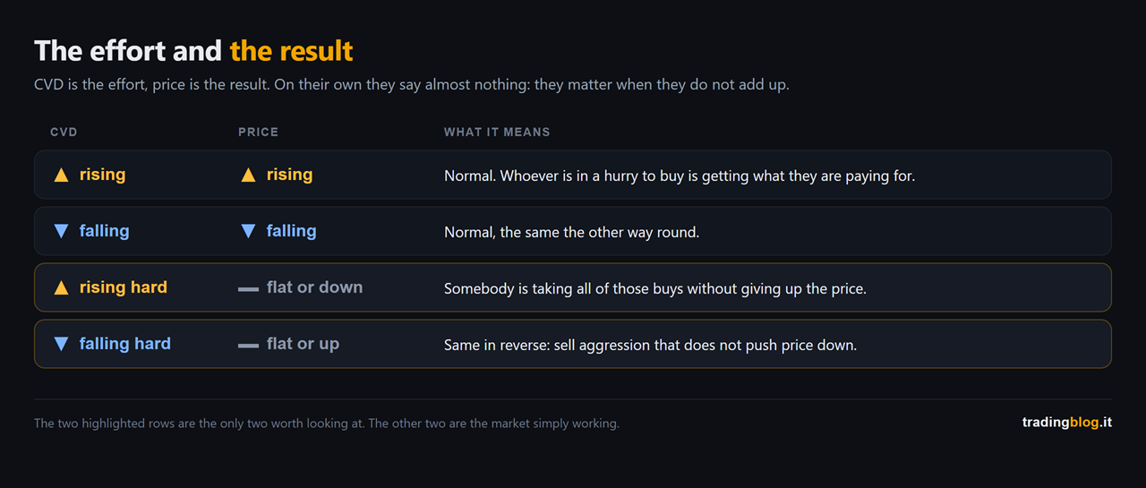
Table crossing CVD and price: when they rise or fall together there is nothing to read, while the two highlighted rows are the ones where CVD runs hard and price stays flat or goes the other way, meaning somebody is absorbing
The matrix between CVD and price. When they rise together or fall together there is nothing to read. When CVD runs hard and price does not move, or goes the other way, somebody is absorbing on the other side.

Look at the two highlighted rows in the figure, because they are the only two that count.

Lots of people in a hurry to buy, and price not going up.

At that point the right question is not “who is buying”. The question is: who is on the other side taking all of them?

The three reasons a divergence appears

And here we get to the part that makes reading this far worthwhile.

Price makes a new high, CVD does not. The famous divergence. On the internet they sell it to you as the signal that gets you the high of the day.

The problem is that the very same picture comes from three different situations, and only the first two are interesting.

One, real absorption. There is a big resting order sitting there taking all the aggression and reloading as they eat it. That is the one we care about, and it is the one we covered in the second episode. You check it on the book, not on CVD.

Two, the iceberg. A huge order shown in small slices. On the book it looks small, in reality it is a wall. Same dynamic as the first, except you cannot see it: you infer it from the fact that the level holds without showing size.

Three, and this is the one nobody tells you about: there simply is no aggression on the other side.

Price rises, CVD does not rise, and not because somebody is absorbing.

It rises because there is nobody selling.

The sellers got out of the way, the road is clear, and price drifts up without anyone having to pay to carry it there.
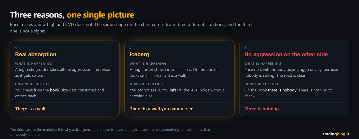
The three reasons a divergence between price and CVD appears, side by side: real absorption which you check on the book, an iceberg which you infer because the level holds without showing size, and simply no aggression on the other side, where there is nobody on the book and nothing to see
The three reasons a divergence appears, side by side: real absorption, iceberg, and simply no aggression. The first two get checked on the book, the third one is not a signal of anything.

That third one is the majority of cases, and it is why a divergence on its own is never enough.

Because the first two say “there is a wall”. The third says “there is nothing”.

And on the chart, under the price, they have exactly the same face.

A case of mine, and the mistake I made with it

ES, 6 August, two screenshots ten minutes apart.

I am telling you about it because I got this wrong first, and the mistake is exactly the one this piece is supposed to teach you to avoid.

At 12:10 price was at 7,756.25, with the book showing a fresh ceiling of sell orders just above, and further up the sellers pulling themselves out of the way.
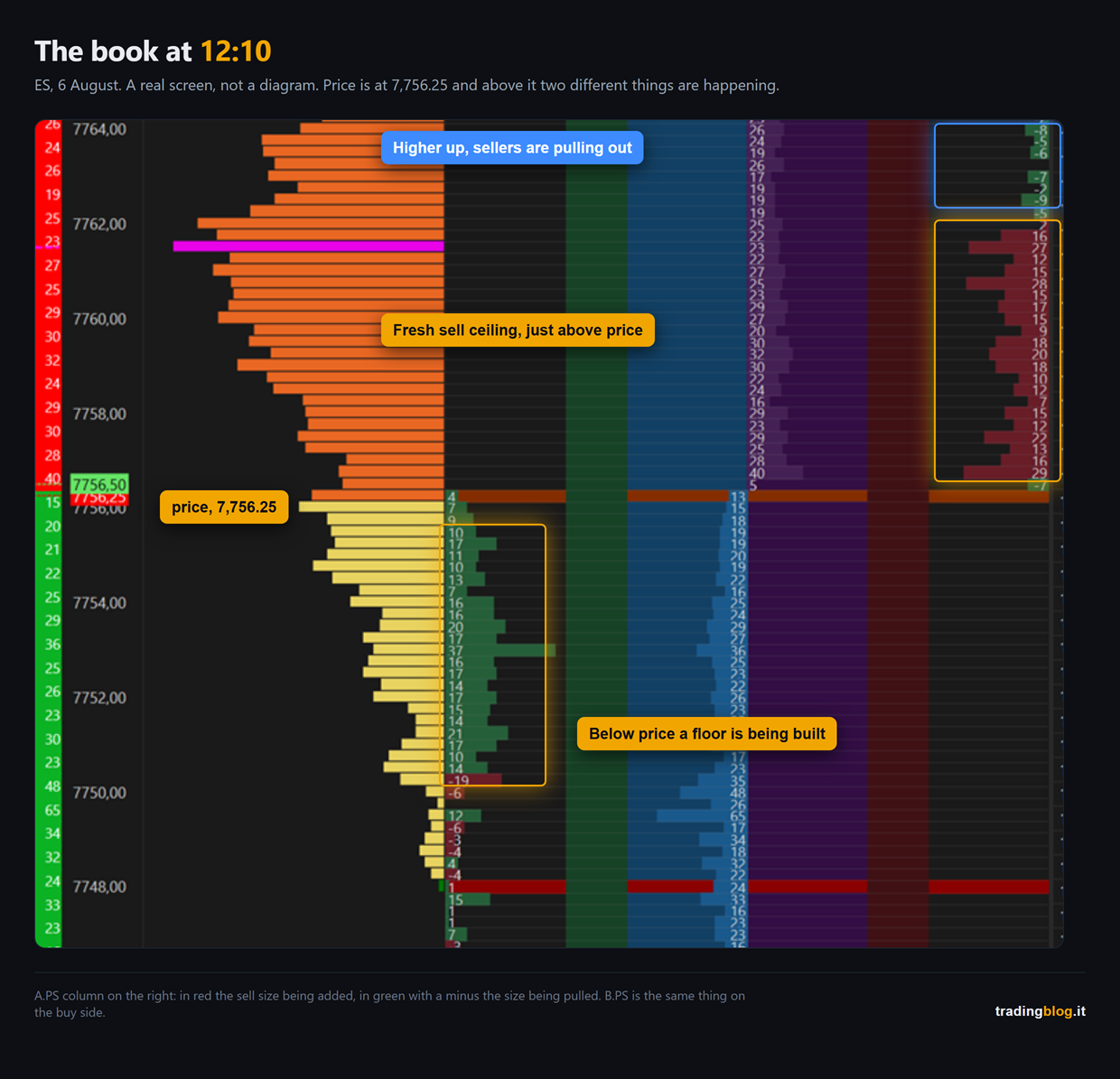
Real screenshot of the ES order book on 6 August at 12:10, price at 7,756.25: in the A.PS column the fresh sell ceiling just above price, higher up the sellers pulling their size, and below price the floor being built in the B.PS column
ES, 6 August, 12:10. The real book: at the top the sellers pulling out, just above price the fresh sell ceiling, and below it the floor being built.

At 12:20 price was at 7,760.25. The ceiling had not held.

Ten points of upside. And underneath, cumulative delta was reading -239.

My first read was this one: CVD is negative, so nobody is buying aggressively, so that rise is not a push, it is a void.

It sounds good. And it is wrong.
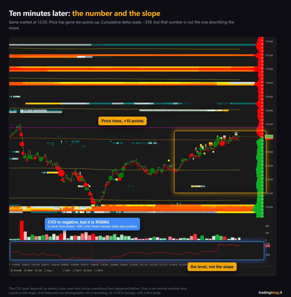
Real screenshot on ES at 12:20: price has risen ten points to 7,760.25 while in the bottom panel the cumulative delta line stays negative at -239
The same screen ten minutes later. Cumulative delta reads -239, but its slope is rising: it came from below -400.

Look at the figure, and look at the slope instead of the number.

Between 12:04 and 12:07 CVD had sunk below the -400 mark. From there it climbs without stopping, and across the window of the rise it goes from roughly -380 to -239.

Which means that over those ten minutes delta was positive by a hundred and something contracts. Somebody was buying and paying the spread, very much so.

That -239 was not describing the rise. It was describing the selling from twenty minutes earlier, still sitting inside it, because CVD is cumulative and carries everything since the last reset.

The level tells you where you are coming from. The slope tells you what is happening now.

And if you go back to the table from earlier, this case is not even a divergence: CVD rising, price rising, first row, normal, nothing to read. Effort and result added up.

It took me months to stop looking at the number and start looking at the tilt. If this piece saves you those months, it has done its job.

Two notes on this example, because I would be annoyed if nobody gave them to me.

These are two photographs, not a recording. They say the transition happened, not whether that ceiling was eaten or pulled.

And it was 12:20 in Europe, meaning US pre-market on the ES: thin book, few participants. Pulling size when there are few people around costs little, and the same read at 15:30 carries far more weight. Do not take the midday ruler and use it at the Wall Street open.

And the clean case of the third reason, the one where there really is nobody on the other side, I do not have in a single screenshot yet. When I capture it I will publish it. Better a hole I admit to than an example that proves something else.

The three traps, and all of them need saying

One. CVD depends on how it is calculated. Every platform decides in its own way how to classify fills, and the results are not identical. There is no “true” CVD and there is no best setting. What matters is knowing how your tool calculates it, and using one only. Comparing the CVD of two different platforms is like comparing two watches set by two different people.

Two. It is cumulative, so it depends on where it starts. A CVD starting at midnight and one starting at the cash open tell two different stories about the exact same afternoon. The absolute level means nothing: only the shape inside the window you chose matters. Pick one and keep it.

Three. On rollover days CVD is garbage. Volume splits across two contracts and the series stops making sense. It applies to volume, it applies to open interest, it applies here. Mark the quarterly rollover dates on your calendar and do not play doctor on those days.

And a note that concerns a lot of you: CVD is read on the future, where the volume is real and centralised. It is the structure I work with and I have always declared it: analysis on the future, execution wherever you trade. A CVD calculated on an instrument without centralised volume is not measuring what it thinks it is measuring.

“A sold rally”

Two words about this expression, which you will hear everywhere.

In the head of whoever says it, it means: price is going up but CVD is going down.

The fact itself can perfectly well be true. It is the conclusion they pull out of it, namely “so now it goes down”, that does not hold.

First, because it can be the third case: there is no aggressive selling, so CVD does not go up, but price goes up anyway because there is no supply.

Second, and more importantly: it is not an entry, because it does not tell you where to enter. An entry is a price. A divergence is not a price, it is a shape.

The line to take home

A divergence is not a signal. It is a question.

The question is “who is absorbing?”, and the answer is not on the CVD. It is on the book.

I look at the book in the DeepDOM.

Two lines of transparency, which feel owed: that above is an affiliate link. If you use it and subscribe I earn a commission, and you don’t pay a cent more.

If you look at the book and there is nobody there, the answer is “nobody”, and then there was nothing to see in the first place.

Used well, CVD is a confirmation that adds to a level you had already marked this morning. It is never the reason that level exists.

Which is also why, in my order of switching instruments on, CVD is the last one. Not the first.

What you do from tomorrow morning

Small homework and for a week you do not trade it, as always.

Mark down ten divergences. They do not need to be pretty, take the first ten you see.

For each one, at that same moment, look at the book and write one single word: was there real size on that level, yes or no.

Then wait and write down how it ended.

At the end separate the two groups and count them.

What almost always comes out is that divergences with size on the book and the ones without behave differently, and that the ones without are the majority.

After that homework you will never look at CVD on its own again, which is exactly the point. If you don’t have a place to keep the notes, the TradingBlog Diary is free and exists for this.

CVD measures who is in a hurry. The book shows who is standing still. Looking at only one of them is like listening to half an argument.

tradingblog.itPosta su X

Let me close with the thing that saved me the most money in this whole story.

It was not learning to read CVD.

It was stopping asking it for what it cannot know.

It tells you who was running. Who was standing still on the other side, and whether they were big, that has to be told to you by a different instrument.

When two different instruments tell you the same thing, that thing stops being your opinion.

Suerte Amigo!

Tiziano Brunno

Tradingblog

Want to put your market reading to the test?

Compete and challenge other traders inside an Arena in a demo environment, with no real capital at risk. Discover the Performance Arena Events by The Thunder Trader.

Discover The Thunder Trader →


Disclaimer: purely informational and educational content. It does not constitute financial advice or an invitation to trade. Trading involves the risk of capital loss.


Glass candlestick split open revealing an inner ladder of glowing cells, blue on one side and amber on the other, bid/ask candle concept

Bid/ask candles: what a normal candle doesn’t tell you

Hey trader,

when I started out I was chasing patterns.

Basic technical analysis, the textbook stuff: engulfing, pin bars, hammers, dojis. I spent my evenings hunting for them on charts and marking them with a highlighter, convinced the whole job was in there. You find the shape, you get in, done.

Then the shape shows up, you get in, and price goes the other way.

It took me years to work out why. And I didn’t get there on my own: I was lucky enough to meet some teachers, and since I rarely mention them I’m naming them here once and for all, because it feels right. Enrico Stucchi and Gianluca Salvatori. They handed me market concepts I had never found in books, and not even in the courses going around back then.

The biggest one of all is also the simplest to say, and it took me a while to digest.

A pattern is not a cause. It’s a drawing that stays on the chart AFTER things have happened. And those things, inside the candle, you are not looking at.

Take the big green candle that makes you want to applaud, long body and short wicks. Beautiful. But inside, at the last prices up top, who was really buying? How many were walking out right as you were walking in?

The normal chart doesn’t show you that stuff. Today I’m showing you a candle cut open.

Four numbers, and that’s it

A classic candle gives you four numbers: open, high, low, close. If you’re lucky, the total volume of the bar. The end.

It’s the final score without the box score. 3 to 1. Ok, so what?

You don’t know who scored, you don’t know when, and above all you don’t know who played better.

Try asking a candle the real questions.

At which price, inside that bar, did most of the trading happen? It doesn’t know. A 20 point bar can have half its volume crammed into the lowest three points, or spread out evenly: two completely different markets, drawn identical.

Who was aggressive, and at which prices? It doesn’t know.

Had the push already died out before the close? It doesn’t know that either.

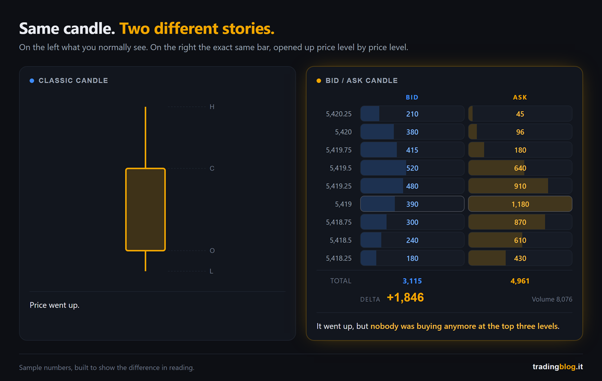
Side by side comparison: on the left a classic candle with only the open, high, low and close labels, on the right the same bar broken down into nine price levels with the volume traded at the bid and at the ask
The same candle, two different pieces of information. On the left, four numbers. On the right, the volume traded at every single price, split between who was aggressive buying and who was aggressive selling.

And here’s the line to take home, even if you stop reading right now.

The color of the candle tells you where it ended up, not who won.

tradingblog.itPosta su X

How a bid/ask candle is built

Let me explain, we start from zero.

Take the same bar and instead of drawing it as a rectangle, split it by price levels: one row per tick, or per group of ticks if the market is wide.

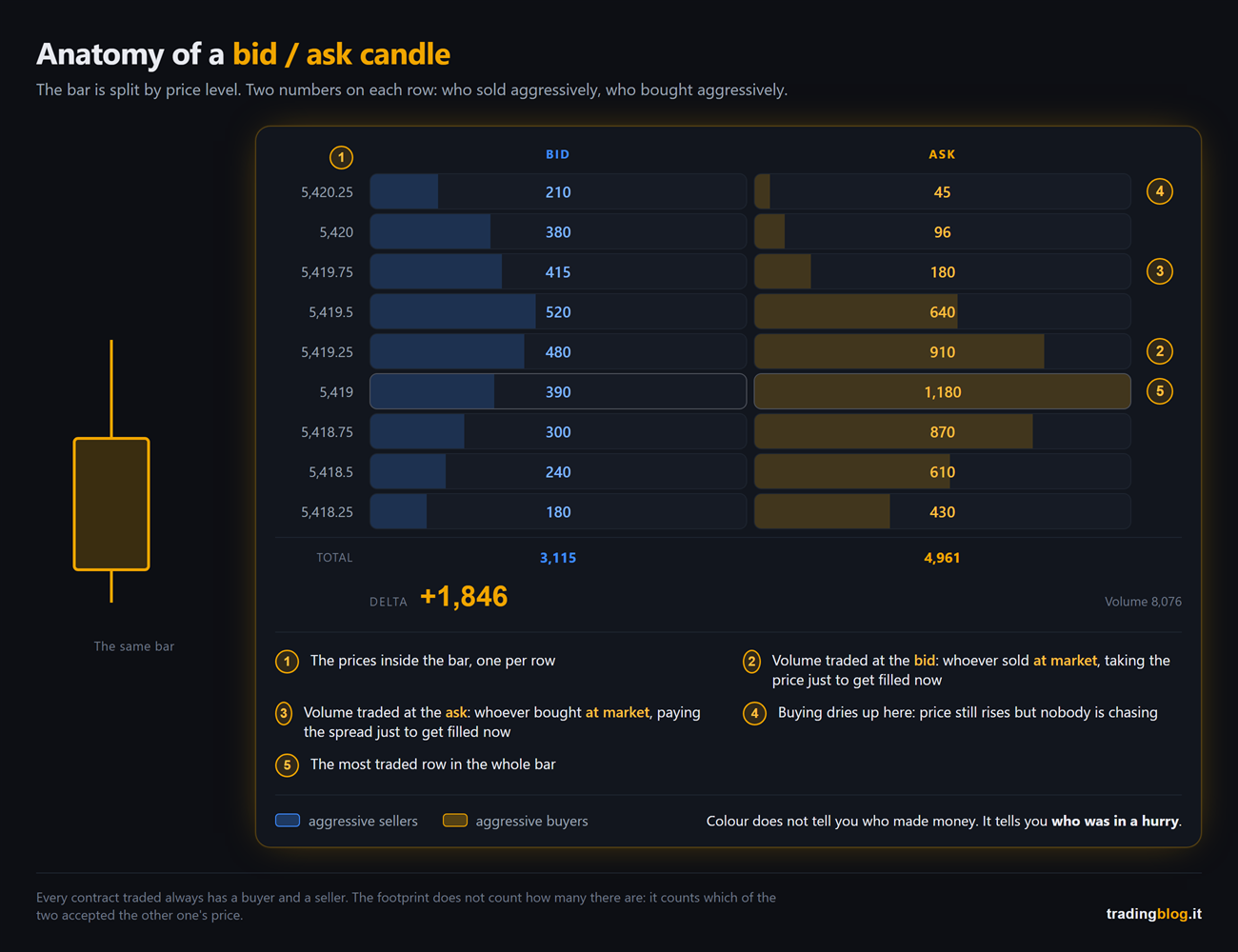
Two numbers end up on every row: on the left the volume traded at the bid, on the right the volume traded at the ask. That is, how many contracts went through hitting the demand and how many went through hitting the offer.

Careful, some platforms swap the columns: check the header before you read the numbers.

The jargon calls it footprint, but on plenty of platforms the menu says something else entirely: Numbers Bars, Volumetric Bars, Cluster, Order Flow Analyzer. The reason is trivial, “Footprint” is a registered trademark and it isn’t everybody’s. So if you go looking for that word and can’t find it, it’s not that you don’t have it: it’s that over there it goes by another name.

Anatomy of a bid/ask candle with five numbered callouts: the price column, the volume traded at the bid, the volume traded at the ask, the point where buying dries up and the most traded row of the bar
Anatomy of a bid/ask candle: the price column, the two numbers on each row with numbered callouts, and next to it the exact same bar as you see it on the normal chart.

Passive and aggressive

There are two ways to be in the market, and this is where everything gets decided.

There’s the one who puts a limit order away from price: they name the price they want and they wait, and until the market comes to them nothing gets executed. And there’s the one who sends a market order: they don’t name a price, they say now, and they pay the spread just to get in.

The bid/ask candle counts who paid to be in a hurry.

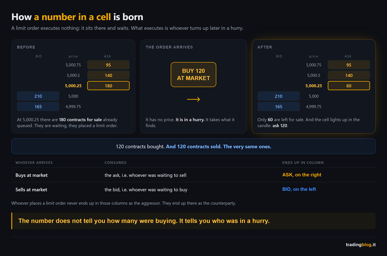
Whoever buys at market takes the price of whoever is selling, meaning they hit the ask, and that volume ends up in the ask column. Whoever sells at market hits the bid, and ends up in the bid column.

Whoever leaves a limit sitting there waiting doesn’t end up in those columns as the aggressor. They end up there as the counterparty.

Three panel sequence showing the order book before and after a 120 contract market buy order arrives, with the table of who consumes what and which column the volume ends up in
How a number is born inside the cell. Before: 180 contracts to sell sitting on the ask, waiting. Then a market buy order for 120 comes in. After: 60 are left on the ask, and the cell lights up ask 120. 120 bought, 120 sold. The same ones.

The line that separates who understood from who repeats

Careful here, because almost everybody out there gets this wrong.

Every contract traded has a buyer AND a seller. Always, by construction: the two quantities are identical by definition. What can be different is how many there were on each side, and above all who moved first.

So those two numbers do NOT say “there were more buyers than sellers here”. That sentence means nothing.

They say who took the initiative, and who was on the receiving end.

A cell printing 340 at the ask means this: 340 contracts bought by someone in a hurry, against 340 sold by someone who was already sitting there in the queue with a limit.

Every big number tells two stories at once, the one who pushed and the one who held. The footprint doesn’t tell you who was right: it tells you they were both there.

Delta, in two minutes

At the bottom of the candle there’s the totals row, and it’s the first one you look at.

Three panels with the total volume, the delta and the most traded price of a bid/ask candle, each with the question it answers
The row at the bottom of the candle answers three different questions: how much traded in total, who was in more of a hurry (the delta), and at which price almost everybody stopped.

Delta is a subtraction: volume at the ask minus volume at the bid.

Positive, and inside that bar the net aggressive initiative was on the buy side. Negative, and it was on the sell side. It does not mean “more buyers” (see above) and it does not mean “now it goes up”.

I’m repeating it because it’s the most widespread legend in this business. Delta measures the effort, price measures the result, and delta is already inside price: when the cell exists, those contracts have gone through and price has already reacted.

The interesting part is when the two don’t match. Big positive delta and price that won’t go up a single tick: somebody is calmly selling everything that lands on them. Or the other way round, aggressive selling flat out and price nailed to the spot.

Effort against result: if you push a scooter uphill like a madman and you don’t move forward, the problem isn’t the push, it’s the weight on the other side.

Same family as GEX: price moves because of people forced to buy and sell behind the scenes, and on the chart you only see the effect.

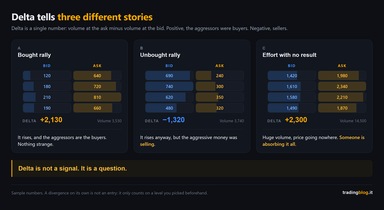
Three bid/ask candles side by side with very different deltas: the bought rally, the rally with negative delta and the bar with huge volume and price going nowhere
The same instrument tells three different stories: the rally that was bought, the rally where the aggressive side was selling, and the bar with huge volume that doesn’t move a single tick. Delta is not a signal, it’s a question.

And now the handbrake.

A divergence, on its own, is not an entry. Delta sends you to look at a level, it doesn’t tell you to click: the level has to be there already, decided beforehand and for other reasons.

The uncomfortable bit: all this needs futures

Now the honest part, the one that might cost me a few readers. Never mind.

The bid/ask candle rests on one thing only: real traded volume, with the aggressor’s side attached to it.

On CME futures (ES, NQ and company) it’s all there. A single centralized order book, official volume in contracts, and above all the aggressor’s side, which the exchange publishes inside the data feed. It isn’t a platform estimate, it’s a figure declared by the exchange. With one exception: in auctions, like the open, the orders all cross together and nobody hits anybody. That volume ends up in the candle with no side, and the first bar after the open doesn’t read like the others.

On spot forex, no. There’s no single book, every broker sees only its own slice, and the aggressor’s side has to be guessed with rules that get it wrong, and get it wrong more often precisely on the big trades.

On CFDs it’s worse still. Your broker is not an exchange: what you see as volume is almost always tick volume, a counter of how many times price moved, not of how many contracts went through.

The practical rule is blunt: you analyze on the futures, you execute where you have the account. And if you don’t have futures data, don’t pretend you have the footprint: better nothing than a fake number.

But “better nothing” doesn’t mean going in blind. If you trade CFDs, at least keep in front of you the numbers that come out of the futures anyway: imbalance, COT, areas of interest on DAX, ES, NQ and Dow. I put them inside Thunder Desk, it’s free, and it’s the way not to go in blind on an instrument that copies a market you’re not even watching.

All the more so because the index is also moved by things that never show up on your chart, like options expiring the same day.

A real case: NQ, July 29

Let me show you how you read a level. How you read it, not how you pick it: that’s the whole of part 2.

July 29, Nasdaq.

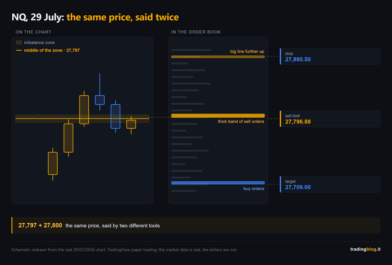
On the chart I had a level at 27,797, coming out of an imbalance area, a gap price left behind while it was running and hadn’t gone back through yet. On its own, it’s a number on a chart. There are a thousand of them.

Then I looked at the order book. Above, at 27,800, there was a thick band of sell orders. Sitting there for minutes.

Two different tools, the same price.

That’s the heart of this piece. Not “the footprint gives the signal”, but two things that don’t talk to each other pointing at the same number.

Limit sell with two contracts at 27,796.88, just under the wall. Stop at 27,880.50, behind another big row further up, not at a distance picked with a ruler. Target 27,709, leaning on a band of buy orders.

Outcome: filled, the first contract covered along the way and the second carried all the way to the full target. +87.88 points on the contract that made it to the end, +152.76 adding the two together.

Schematic of the NQ case of 29 July 2026: on the left the chart with the imbalance zone and its midpoint at 27,797, on the right the order book map with the band of sell orders just above, plus the entry, stop and target levels
NQ, July 29, 2026: the same price flagged by two tools that don’t talk to each other. On the left the chart with the imbalance area, on the right the band of sell orders sitting just above. Diagram redrawn from the real chart.

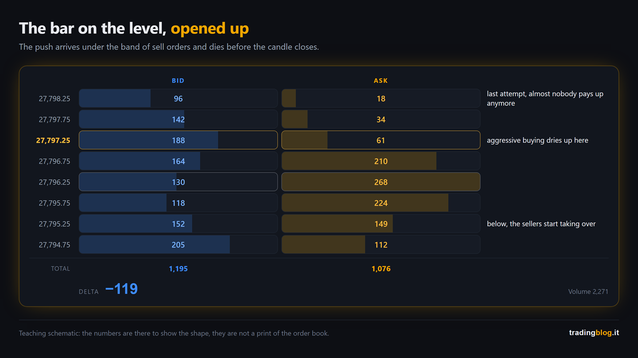
And the bar that touches that level is the place where you need to open the bid/ask view. What you want to see, on the way up towards the wall, is the aggressive buying dying out row after row and the bid growing: the push that ends before the top. If it’s there, the wall is real. If it isn’t, that level is just a number.

I have the bid/ask view on DeepCharts by Volumetrica, where it’s called Order Flow Analyzer, while the liquidity map lives in the DeepDOM. Two different things, two different names.

Two lines of transparency, which feel owed: those above are affiliate links. If you use them and subscribe I earn a commission, and you don’t pay a cent more.

Reconstruction of a bid/ask candle on the level: going up, the volume traded at the ask falls row after row while the volume at the bid increases
The bar on the level, opened row by row: on the way up towards the wall the volume hit at the ask dies out and the one at the bid increases. Teaching diagram, the numbers are there to show the shape, they are not a printout of the order book.

Now the part almost nobody shows you.

Same day, same reading, I had the twin on the ES. The level was there, the order was there. It never started, it never got filled, full stop.

Why, we’ll see in the next part.

What you do from tomorrow morning

The homework is small, and that’s exactly why you should take it seriously.

For one week, you don’t trade this stuff. Zero.

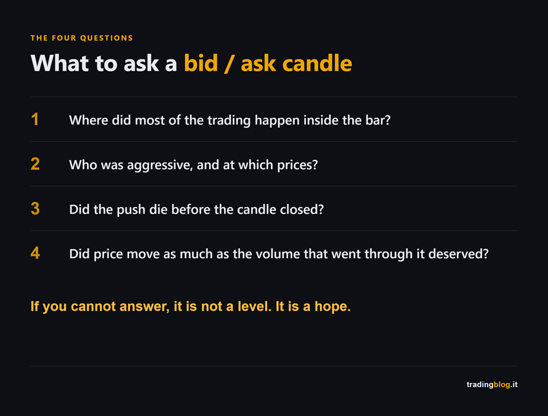
Open the bid/ask view on a future you already follow, look only at the points where price turned, and at every turn ask yourself four questions.

Card with the four questions to ask a bid/ask candle before even thinking about an order
The four questions to ask every bid/ask candle, before you even think about an order: where most of the trading happened inside the bar, who was aggressive and at which prices, whether the push died out before the end of the candle, and whether price moved as much as the volume that went through deserved.

Then write your readings down, and write them BEFORE you know how it ends: with hindsight we’re all right. If you haven’t got a place to put them, use the TradingBlog Diary: it’s free, and you end up with a log of your readings instead of your memories. Which never match 🙂

In the next part we open the operational drawer: absorption, exhaustion, stacked imbalances and the delta that doesn’t add up. That is, how you go from “I get what I’m seeing” to “I know which price I put my order on”. Here it is: absorption, exhaustion and imbalances, that is how you pick the price of your order.

Knowing how to read a bid/ask candle won’t make you a single euro. It takes away your excuse for saying the market has gone crazy. It never goes crazy: it’s us, staring at the colored rectangle and telling ourselves the comfortable story.

I’ll stop here. If you know a trader who gets in on big green candles because “they’re nice and full”, send them this piece. It costs you nothing, and it saves them from making a fool of themselves the way I did.

Suerte Amigo!

Tiziano Brunno

Tradingblog

Want to put your market reading to the test?

Compete and challenge other traders inside an Arena in a demo environment, with no real capital at risk. Discover the Performance Arena Events by The Thunder Trader.

Discover The Thunder Trader →


Disclaimer: purely informational and educational content. It does not constitute financial advice or an invitation to trade. Trading involves the risk of capital loss.